
Anna Permyakova / index / Enganyo
Enganyo
Branding and Website redesign

00. Project scope
Team: Anna Permyakova & Olivia Waligora
Timeline: 2 weeks
Client: Enganyo Studio
Tools: Figma, Figjam, Zoom, Slack
About Enganyo
Enganyo creates versatile, expressive bags designed for spontaneous, on-the-go lifestyles. Inspired by a passion for functionality and bold, rebellious design, Enganyo offers a product that adapts to unexpected moments — transforming seamlessly from cross-body to backpack.
Brief
Enganyo stakeholder came to our team with a problem - their current website was not bringing new purchases. We were challenged to propose the new branding solution, that reflects on Enganyo’s duality as well as to explore the new visual solutions for their current website.


01. Branding
As part of the redesign process, we developed a new branding solution that reflected the company’s vision, values, and target audience. This included refining the color palette, typography, and visual elements to create a cohesive and modern identity. The updated branding not only enhanced the overall aesthetic but also strengthened brand recognition and emotional connection with users.

Colors
The color palette of Enganyo is bold and vibrant. It communicates Enganyo’s boldness and leaves a room for fun exploration of the gradients.

Brand Identity
Enganyo’s brand is a perfect balance between confident loud typography and soft futuristic gradients. It translates the brand values and vision through a clean minimalist layout and makes it possible to scale up the brand for any future application.
To ensure brand’s bold online presence, we prepared templates for social media content. Each template is customizable, enabling teams to easily tailor posts for specific campaigns or announcements. With a focus on high-quality design and strategic messaging, these templates help reinforce brand recognition and drive audience interaction.
Typography
We chose a Inter (Google font) with the clean geometric shapes to reflect on brands modern look and feel. This will ensure a cohesive look of the brand throughout all the digital and offline channels.


Social Media

✨Branding Process reflection
The stake holder came to us with a freshly redesigned logo and was open for branding proposal. In the end we delivered a beautiful neat solution, that brings brand voice to live. It was a very inspirational part of the project, that lead to delivering the next steps of the project.

02. UX Design Process
Customer knows better
To be sure we’re aligned with the customer needs, we conducted 5 interviews about their online shopping experience. The goal was to understand the low points and motivations for our users, in order to complete a purchase.
In each interview we covered 5 objectives:
Importance of brand trust & security to complete purchase
Ease of the payment process
Lack of brand authenticity: emotional and visual connection
Clear product presentation and details
Easy delivery processes
Demographics
The second stage of the project included a UX research. For that we followed Design Thinking process. The main challenge was to explore the market, talk to potential customers, define the problem, and deliver a website prototype.

6 Interviewees
2 female 3 male
20-30 years old
All live in European Capital
All have interest in local brands
User Persona
To create a website, that truly resonates with Enganyo customers, we created a User Persona.
Marco is a young, active barista living in Berlin. His lifestyle is fast-paced, filled with concerts, hiking trips, and spontaneous weekend getaways. He values both functionality and style, seeking versatile products that suit his on-the-go life. Marco prefers quality over quantity, always choosing items that are practical and durable.
A strong supporter of small businesses, Marco loves feeling unique and connected to brands that reflect his individuality. He prioritizes convenience and trust, expecting seamless, secure online shopping experiences. For him, buying from independent brands feels personal and special.
Defined Problem
Enganyo customers, young and stylish people, want to purchase their bags through a trustworthy and authentic website, because they don’t want to spent time stressing about their orders.

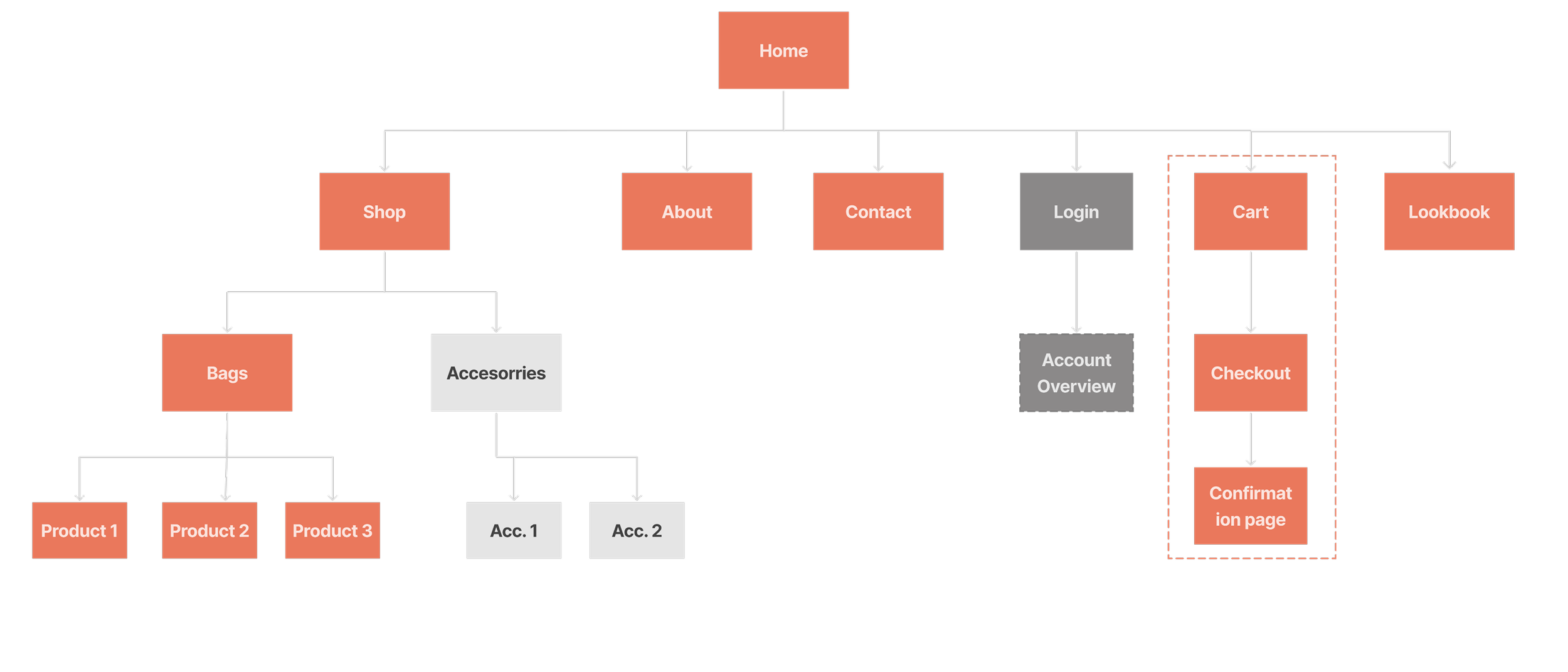
Site map
Enganyo is new to the market, at the point of our wqork together, they offered a limited amount of products. It was our challenge to make a website for a small brand with a potential to scale it up in the future. Another thing we had to consider - Enganyo is using external payment platform, that has to be natively integrated into a new design. To have a clear vision of the website structure, we visualized it with a site map.
With all the research about customer needs, our main focus in designing the new website for Enganyo. Before jumping into UI part, we created a mid-fi wireframes, that are representing all the main features of the website.
These included:
Redesigned Home page, with a clear visual of the product
Added clear CTAs and contextual user flow
Added brands story
Redesigned Shop page and Product landing page
Completed the Order confirmation page, as it was missing important information, that users mentioned at the interviews.

Delivered Solution
We redesigned the website with a clean layout and consistent icons, making the navigation easier and more user-friendly.
Wireframes
User Interviews Highlights

Usability Test
To make sure we were going the right direction, we conducted Combined testing, which included Card sorting, Concept texting and Usability testing.
Overall user’s feedback was positive, people reacted to the website positively.
Some feedback included:
Reconsider a Hamburger menu, as it adds an extra step for users
Make sure the home page visuals tell the Unique brands story

✨UX Process reflection
The Research, Empathize, and Test phases were honestly the most eye-opening part of the process. Talking to real users and hearing their stories made everything click—we weren’t just building a product, we were solving real problems. Research helped us ground our ideas, empathizing connected us emotionally, and testing showed us what actually mattered. It wasn’t always easy, but it made our work feel meaningful and human.
03. UI
Pages overview
The mid-fidelity wireframes and usability test with real users helped to define the weak points the website and after a few rounds of of iterations, we came to the final designs of the website. Below are the highlights of the website.
Bringing a brand to live in a form of a website is always an exciting process for me as a designer. You have to think in a scale, combining brand’s personality and user needs. I love the end result! But I do believe it can be improved further. As per May 2025, the stakeholder has started implementing branding elements into Enganyo’s social media content and is planning to implement the website until the end of 2025. Excited to see it live!
As the third and last stage of the project, we designed a website UI that reflects the brand’s core idea of duality - blending function with bold self-expression. Bold typography and punchy accent colors highlight key interactions, while the overall design stays intuitive and responsive. It’s a digital space that feels as flexible and dynamic as the product itself - built for users who are always on the move.

✨UI process reflection
Project Summary
Project Summary

Deliverables
Team
Total time spent
Brand guidelines
UX Research report
Figma Prototype
Figma file for developers
Anna Permyakova (Branding, UX/UI)
Olivia Waligora (Branding, UX/UI)
1 month