
Anna Permyakova / index / Spilk - Complete app redesign
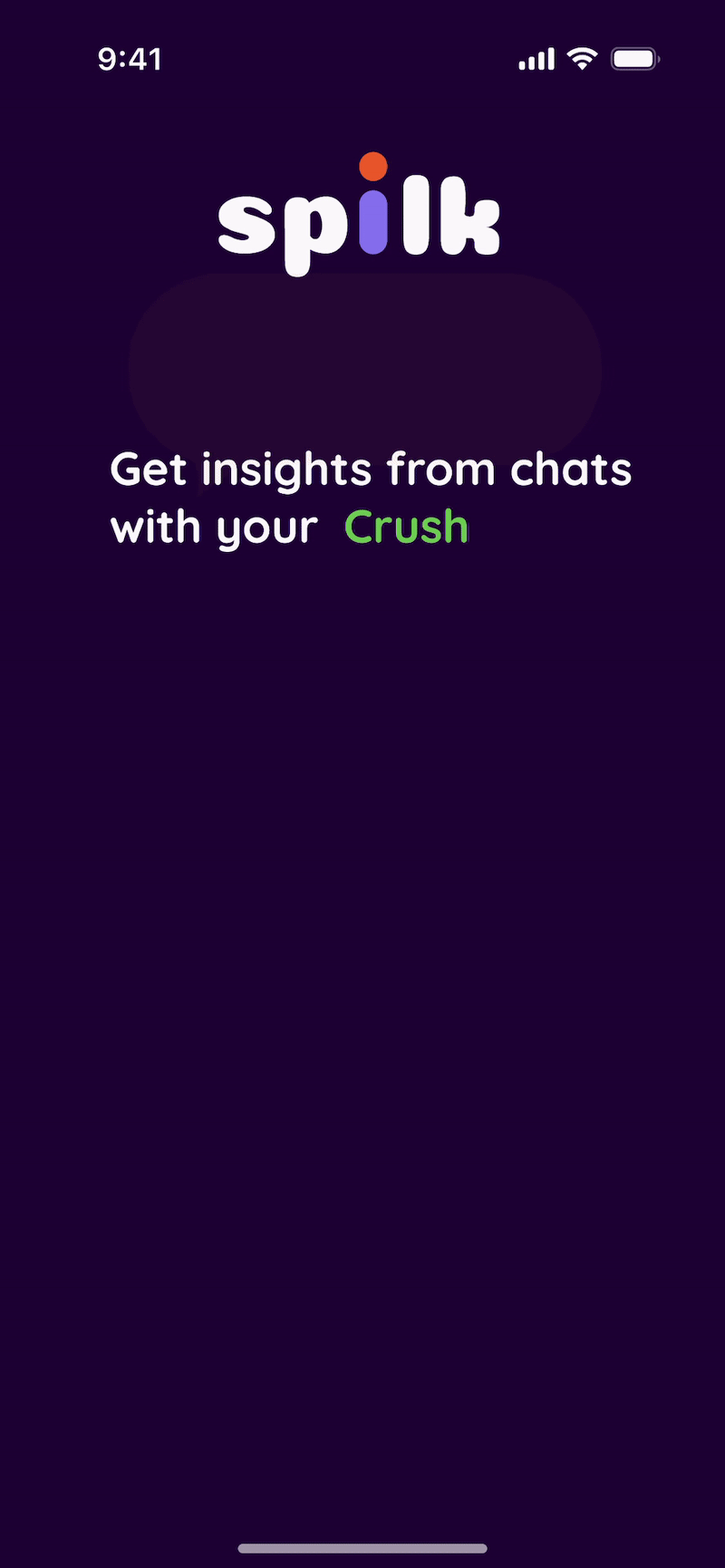
Spilk
Turning Insights into Identity: The complete app redesign that makes user feel emotionally connected

00. Project scope
About Spilk
Spilk is an phone application that uses AI in order to analyse your chats and extract relevant and interesting insights such as: who texted more, who ghosted more, or what word you uses the most.
Brief
The goal was to enhance the overall user experience by simplifying onboarding, making key features more intuitive and engaging, and refining the app's visual identity. Together, these improvements created a more cohesive product experience while strengthening the connection between the brand and its users.

01. Branding


Spilk is an app that helps users gain insights from their chats. The target audience is primarily people in their 20s - those who are either looking for fun insights to share with friends or aiming to better understand the underlying meaning behind messages. When designing the branding proposal for Spilk, we kept these users at the heart of the process.
Before beginning the visual direction, we asked users what they felt was lacking in the app’s current design. Many mentioned a lack of emotional connection, saying it felt “too serious” and more suited to a banking app than a chat insight tool.
Our challenge was to create a visual system that communicates trust while also embracing a fun, playful side.
Logo
Spilk logo is the brands name written in Coiny typeface with modified letter i. Through the animated logo, we implemented all the brand pillars. The letter i turns into a user, the chats and the insights.
Primary logo

Primary Logo Animation

Secondary Logo

Secondary Logo Animation
Colors
The color palette of Spilk is bold and vibrant. We choose a dark theme of the app with the accent colors to highlight the most important information. The challenge was to find a balance and use these accent colors moderatly and on point.

Typography
To make the brand look cohesive, we chose fonts with rounded ends. Coiny is used for marketing communication as an accent font. Quicksand is for all the UI purposes. Both fonts are web friedly (google fonts).

Inapp Micro-interactions

We explored the Circle shape further, refining its visual language and seamlessly integrating it into our onboarding animations to create a more cohesive and engaging user experience.
Icon set
The icon set features a minimalistic and clear design, emphasizing simplicity and ease of recognition. By echoing the rounded shapes, the icons maintain visual harmony and contribute to a cohesive aesthetics.
Inapp Stories

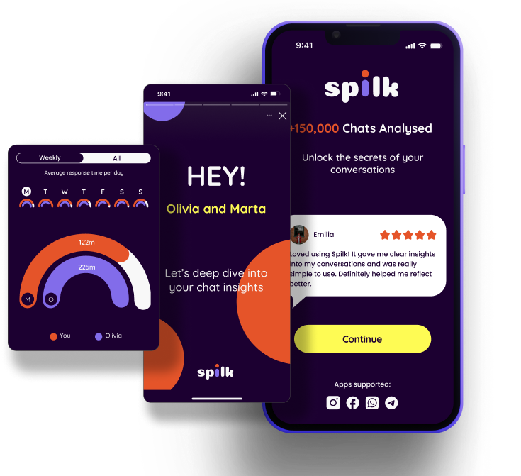
One of the most loved features on Spilk is the Insights Stories section, done in a Spotify Wrapped style. We created a set of templates for different content they might want to highlight in the future.
Insights graphs design
The main feature of the app is the chat insights graphs. We designed a set of graphs inline with our new branding for the main overview insights page and for all the single pages with details about the chat metrics. Our focus was clarity, engagement and brand consistency.
Insights graphs - Small

Insights graphs - Medium

Insights graphs - Large

UX Design Process
In our stakeholder interview, several key insights emerged. First, users don’t clearly understand the app’s value during onboarding. The most loved feature is the “Wrapped” chat stories — they’re engaging, viral, and serve as a strong hook. While privacy is technically robust, users aren’t aware of it because it’s not clearly communicated. Lastly, the branding is flexible, which is a strength, but it still lacks clear definition. We also need to tailor everything more closely to our primary audience: young users under 30, especially in LATAM and Spain.
Emphasizing with Users
From the user survey, we learned that privacy and data control are a top priority — 80% of users care about it, but it's not clearly communicated yet.
Over half of Users also want the onboarding to be quick and easy, they would benefit from an interactive preview of the app, and the same number want to see visual examples of the insights or Wrapped stories during onboarding.
Only 30% mentioned user reviews, but still it adds value to onboarding.
Survey

Interview Demographics
Most users we spoke to were men under 25, mainly from Spain and Portugal.
This aligns well with Spilk’s young, Southern European audience.
From our interviews, it was clear that users want clear and smooth onboarding, with privacy clearly explained.
They’re drawn to playful, yet insightful, easy-to-engage chat stats that will help them understand and improve communication.
User Interviews Highlights

User Personas

For defining our user personas, we decided to create two different ones, based on out research findings. Both would have the same journey, but the motivation is slightly different.
Meet Alejandro and Daniela.
Alejandro is young fun and wants to use Spilk as an interactive, fun tool to connect with his friends.
Whereas Daniela, searches more for insights and meaning around conversations with romantic partners.
We wanted to respect both personas motivations in our project, in order to create the most engaging and insightful product.
Defined Problem
Gen Z individuals need a way to clearly identify emotional patterns in chat data to better understand and improve communication with important people in their lives.
Delivered Solution
We redesigned the app’s onboarding flow, taking into consideration industry standards and user testing results. Alongside this, we proposed a refreshed brand identity for the app, featuring a more engaging visual style for the insights graphs. Altogether, these updates contributed to a renewed look and feel that fosters a stronger emotional connection between users and the experience they have while interacting with the app.
Wireframes
All the research insights led us to creating mid-fidelity wireframes. We took a lot of times to think those through and create a prototype that will be easy to understand for our combined usability testing, and that reflected everything we learned from our reasearch.

Usability Test
The usability testing proved that the new app layout, the information hierarchy and insights structure was resonating with users and providing them clear and engaging insights.
We had some minor comments around text sizing and clearer sections separations or button functionality, which we resolved before moving into hifi wireframes.
App UI
Using the mid-fi wireframes as a base and usability test results as the decision driving force applying the branding on top, we came to the end results. Spoiler - users loved it! And the stakeholder as well.
Onboarding Flow
In the onboarding screens we applied the following changes:
Simplified the process, by eliminating the chat upload instructions, and decreasing user overwhelm.
Created trust with Testimonials and clear information.
Added an App Demo to show the unique value proposition of the app.
Chat Insights
In the Chat Insigths screens we applied the following changes:
Organized information clearly in bento-box style sections.
Made the graphs reflect the data in an engaging and logical way.
Project Summary
Project Summary
Deliverables
Brand guidelines
UX Research report
Figma Prototype
Figma file for developers
Team
Anna Permyakova (Branding, UX/UI)
Olivia Waligora (Branding, UX/UI)
Nargiz Safaraliyeva (UX/UI, Project Manager)
Total time spent
2 month